
When you’re having the classical conflict of wanting to raise your service level and lower your inventory bindings, the Graphical Inventory tool is a nice tool to help you understand each item.
So for instance, if we look at our front wheel, and I’ll just shortcut the graphical view from here, and I’ve included history to see how is my inventory profile normally for front wheel like this, and I can see here the lowest inventory is normally 30, and it’s very steady. I would expect this in the future, this profile to be part of the future, and I would expect it to look exactly like this. So if there’s no more deviation than what I can see here, will my safety stock of 30 be okay, or could we lower it to 15 and still have the same service level.
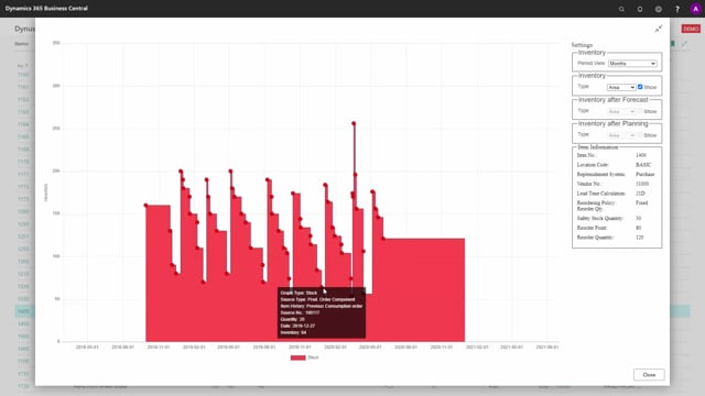
And likewise, when discussing and optimizing all your items, it’s very easy to click the item, look at the graphical profile to see what is the profile of this item. This one looks very bad with a very high safety stock on it. And in this way, you could just continue investigating the different items while discussing and having a graphical view. Basically, you can graphically see if this seems steady or if it has a high deviation. So this has a little more deviation, but not much. And I wouldn’t hesitate to lower the safety stock of an item like this, whereas on the other hand, if we go to some of the top level items, for instance, the bike up here, I can see that the deviation on this one is much higher. I do have some peaks where it comes rather close to zero. I could just go to one. And if this is a very important item and I don’t want to get out of stock, this is an okay profile.
So using this tool provides a very nice overview of the inventory bindings of your items and also of the service level.